TO BE UNIQUE, DON'T SAY "UNIQUE"
Project Sara is turning the restaurant industry on its head, creating one-night events with badass chefs and mixologists for unforgettable experiences for the attendees. Their site tried to tell us that, but it ended up sounding trite and generic, and their beautiful design looked like a coop and didn't accurately convey the mission.
BEFORE
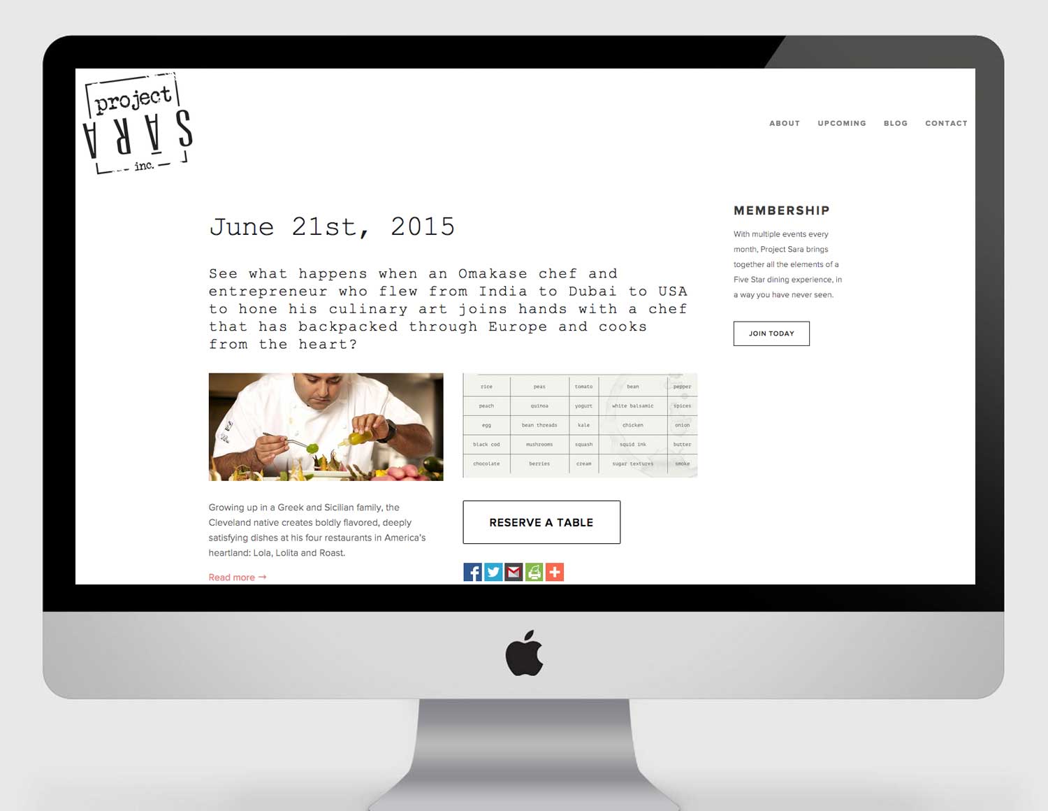
Sometimes a small business' brand design can look cool, but still confuse visitors as to what they offer. Make sure you show what you do and don't just tell - We register images a bazillion times faster than words.
AFTER
THE LOGO IS A REPRESENTATIVE OF THE BRAND
UPSIDE DOWN LOGO = A UNIQUE, UNRESTRAINED BRAND
___________
You don't need to explain every detail. Instead, create a mood, and get the viewer to feel the brand instead.
Share valuable info
By sharing recipes on the site, Project Sara is not giving attendees a reason to visit and visit often. This is also valuable content that they can share on social media, further directing traffic to the site that will turn into attendees.


