MODERN. PROFESSIONAL. CLEAN. SOPHISTICATED. COOL.
Everyone wants their brand to be at least a couple of these things. But what does Modern, Sophisticated, Professional, Clean + Cool look like?
PROBLEM:
Words often only give the illusion of communication and understanding; we all think we know what "modern" looks like, but we all think something different.
Two very different examples of "modern"
SOLUTION:
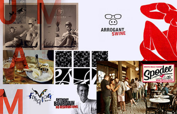
Mood boards get the client and the designer on the same page.
The mood board gives us a chance to understand, for example, whether or not our definition of “modern” matches up with their definition of “modern" (see example above.)
They create a foundation of understanding by agreeing on the definition of the most crucial sentiments that will inspire the creative work. Without such agreement, it's likely a designer and a client will have different ideas of where the project is headed, leading to the client feeling like they didn't get what they paid for.
And it’s why, time and again, our clients tell us our first round of brand concepts is spot on. Here are 4 examples of mood boards designed for our clients, ALL of which can be considered modern and sophisticated. However, each contains its own distinct imagery and style that represents the values and personality of each individual brand.
This brand is futuristic and aggressive with an emphasis on mobile devices since it is an app.
This brand is more artisan, with a handcrafted feel and imagery to match since it is for a specialty food product.
This is a colorful, friendly and community-based board for a upbeat company that provides services for non-profit organizations
This board is elegant and minimalist, but with natural texture for a jewelry brand that uses uncut stones.
You can also check out the approved mood boards at the beginning of these 1st round brand presentations, and then see the brand concepts that followed. As you can see, mood boards are crucial to getting on the same page with your design firm to ensure you are happy with the results!


