IS YOUR FONT HOLDING YOU BACK? 4 MUST READS
1. FONTS ARE LIKE PEOPLE
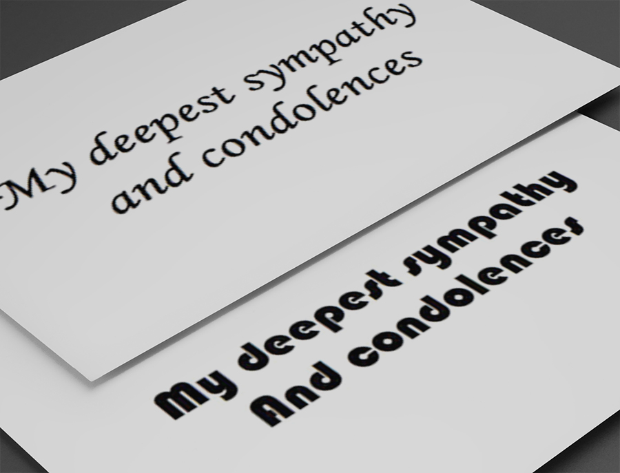
Every font has a distinct personality that is influencing how we interpret the words they are expressing, whether you are aware of it or not. Our feelings about typefaces are dictated by factors such as our collective experience, history and culture. Font history geek out session here.
2. USING THE WRONG FONT FOR YOUR BUSINESS CREATES DISSONANCE, AND THAT LOSES TRUST FROM YOUR MARKET
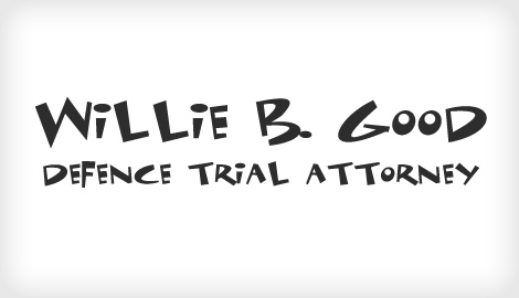
If you're a lawyer charging $800/hour, would you show up to a business meeting in a ripped t-shirt? Likewise are you trying to sell graffiti covered skateboards dressed in a 3-piece suit? Getting the font wrong on your marketing materials, including your website, can be like walking into the meeting in the wrong outfit. Yes, you still showed up, but get the font terribly wrong and people will be subconsciously thinking something that contrasts what you are actually saying. Here's an unfortunate comic font used by a lawyer. Would you take him seriously?
3. YOUR OPINION MIGHT BE YOUR WORST ENEMY
While you may prefer a thin, script typeface, if your a sporting goods company, it's probably not the best option for you. If you ignore the general perceptions of a font or design choice in favor of your own personal opinion and you get it wrong, it will hurt your business. As important as it is for you to love your brand, it is equally important to be aware of how your audience will identify with your expression. Therefore the general perceptions of a font's personality should dictate which font is used for your brand over your own personal taste.
4. 1-2-3, LEARN BASIC TYPOGRAPHY
Below are some general font rules that can be applied to your business. These associations are not set in stone but are a good place to start.
Feminine & Elegant
Thinner, more elegant fonts are associated with beauty or femininity and as a result are often applied to women's fashion & lifestyle brands. That's not to say that a thin font cannot be masculine, but it, too, would most likely be associated with men's fashion or lifestyle.
Masculine & Bold
In contrast to the thin elegant typefaces, heavier, thicker fonts can be more masculine as well, because of their sturdiness and less exclusive than thinner, more sophisticated fonts.
Case Sensitive
Upper or lowercase characters are an added variable to font personality. An uppercase font is louder, more urgent and commanding than a lowercase font which in comparison seems friendly, understated and even childish or youthful.
Serif & Sans Serif
Another broad personality perception is the difference between serif and san-serif typefaces. Since serifed fonts were created and used long before san-serifed fonts they don't just feel more classic and traditional, they actually are. Modern typefaces like helvetica are in fact more contemporary than serif fonts like times new roman, and this association is unavoidable.
FINAL THOUGHTS - HISTORY REPEATS ITSELF
Many times the history of a font is a better indicator as to what its public perception is rather than your individual opinion of it. The list of traits of different fonts and what feeling their distinguishing elements project can go on forever, which is why having an expert with knowledge of typography is imperative for applying fonts to businesses, products and brands.


